Airbnb
Airbnb
Senior Production Designer
(Contract)
Working as part of Airbnb’s global marketing team, Dallas was a part of designing assets for the App Store, Press, and Airbnb Resource Center that showcased the all-new Airbnb app. These assets were key to communicating the product’s features and ease of use, as well as upholding Airbnb’s brand recognition for their 2025 Summer launch.
The Ask
Create an evergreen App Store product page that would not only showcase the key features of the 2025 Summer Release, but be a year-round overview of the app – highlighting the features that sets Airbnb apart. The audience consisted of primarily first-time app downloaders, while still keeping existing users that come back to App Store to update in mind. These assets were to be created for both the Apple App Store as well as the Google Play Store. Surfaces to be considered included the product page header image, product preview carousel, as well as in-app promotional assets.
App Store
After an extensive audit of how different brands use App Store surfaces to express their brand and highlight key product features, there were some key findings that arose:
Its easy to create clutter in a suite of cards
Parity between visual and story is a delicate balance
Digestible messaging means a quicker viewing experience
Based on these findings, some guiding principles were established:
Clear: Gives people a clear understanding of what Airbnb is and what it is they offer
Differentiated: Showcases what sets Airbnb apart
Inspiring: Is engaging and encourages people to download
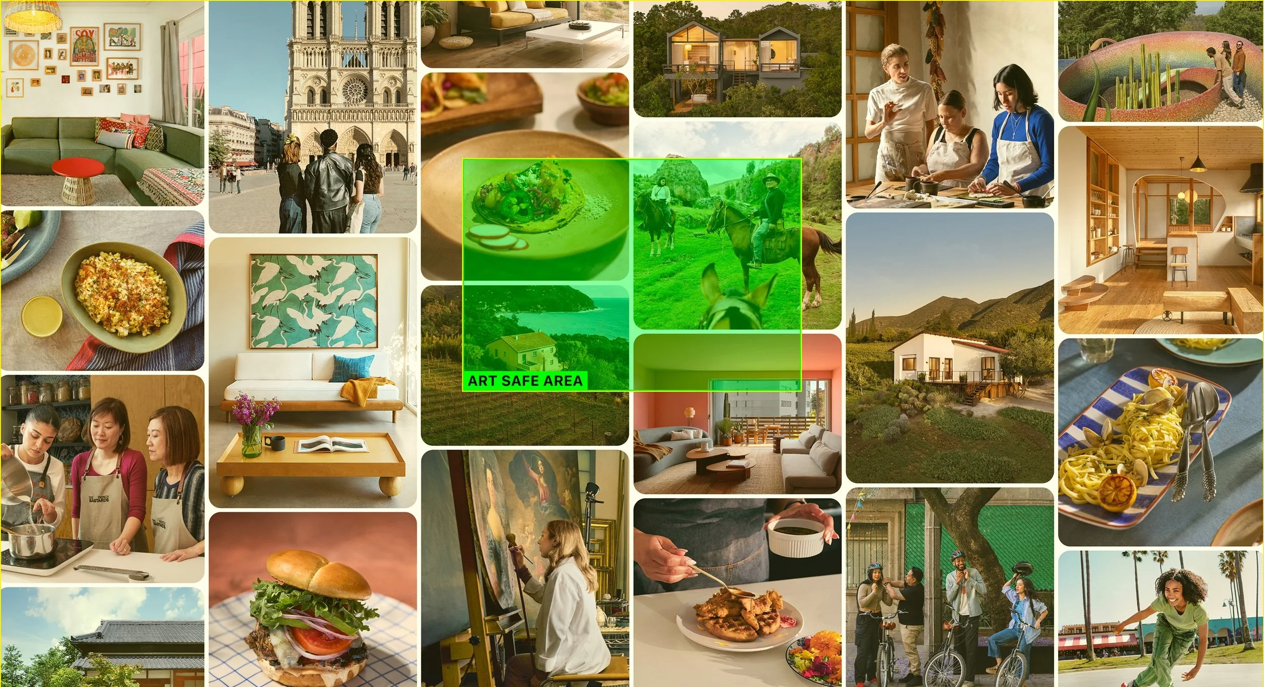
Understanding the Landscape

Across the different surfaces on the App Store product page, it was important to consider how these different assets would live together within a cohesive ecosystem. Together, they had to feel like they were part of the same story and driven by a unified Airbnb brand vision.
Airbnb App Store Ecosystem

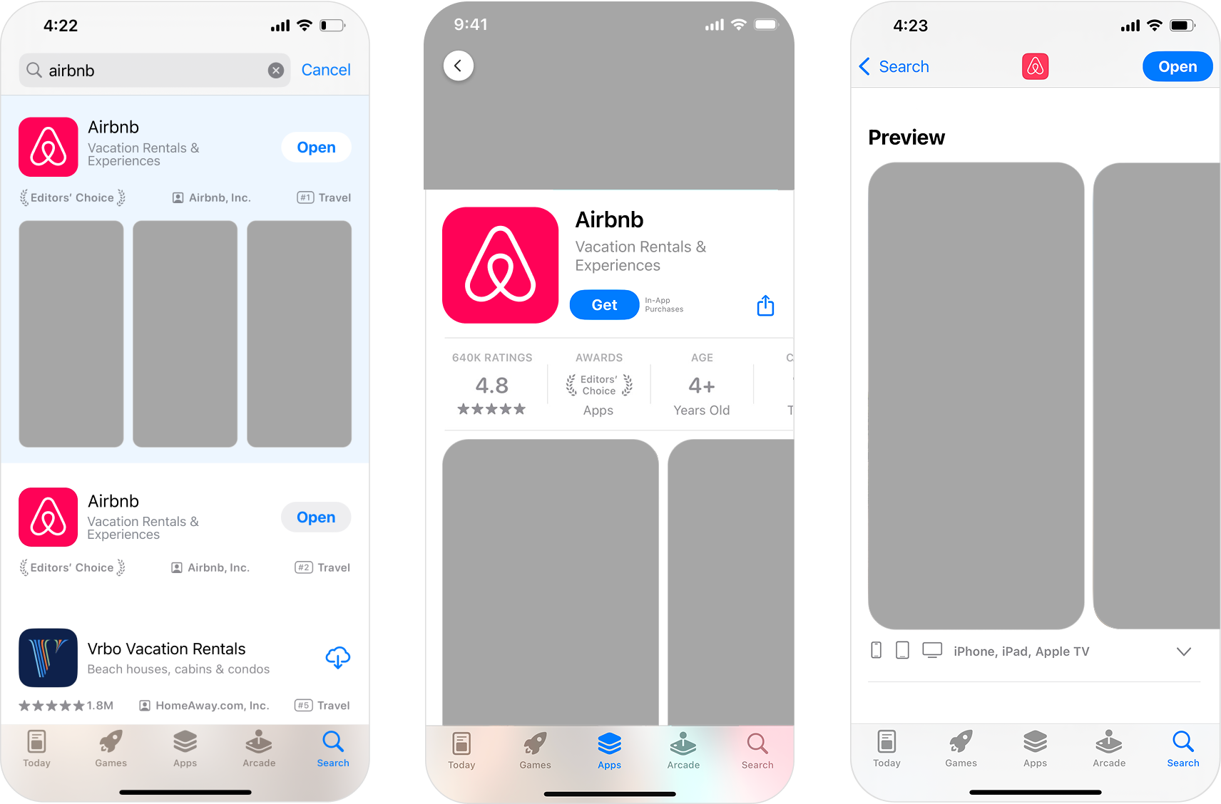
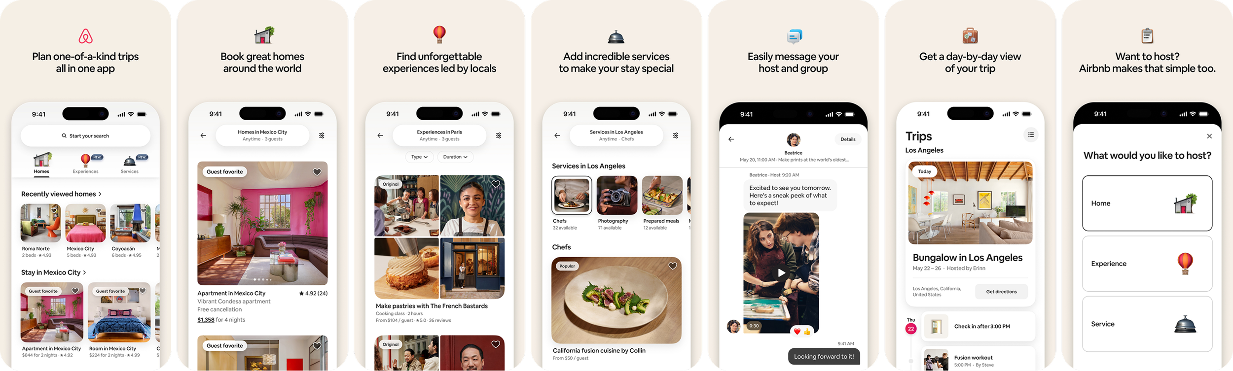
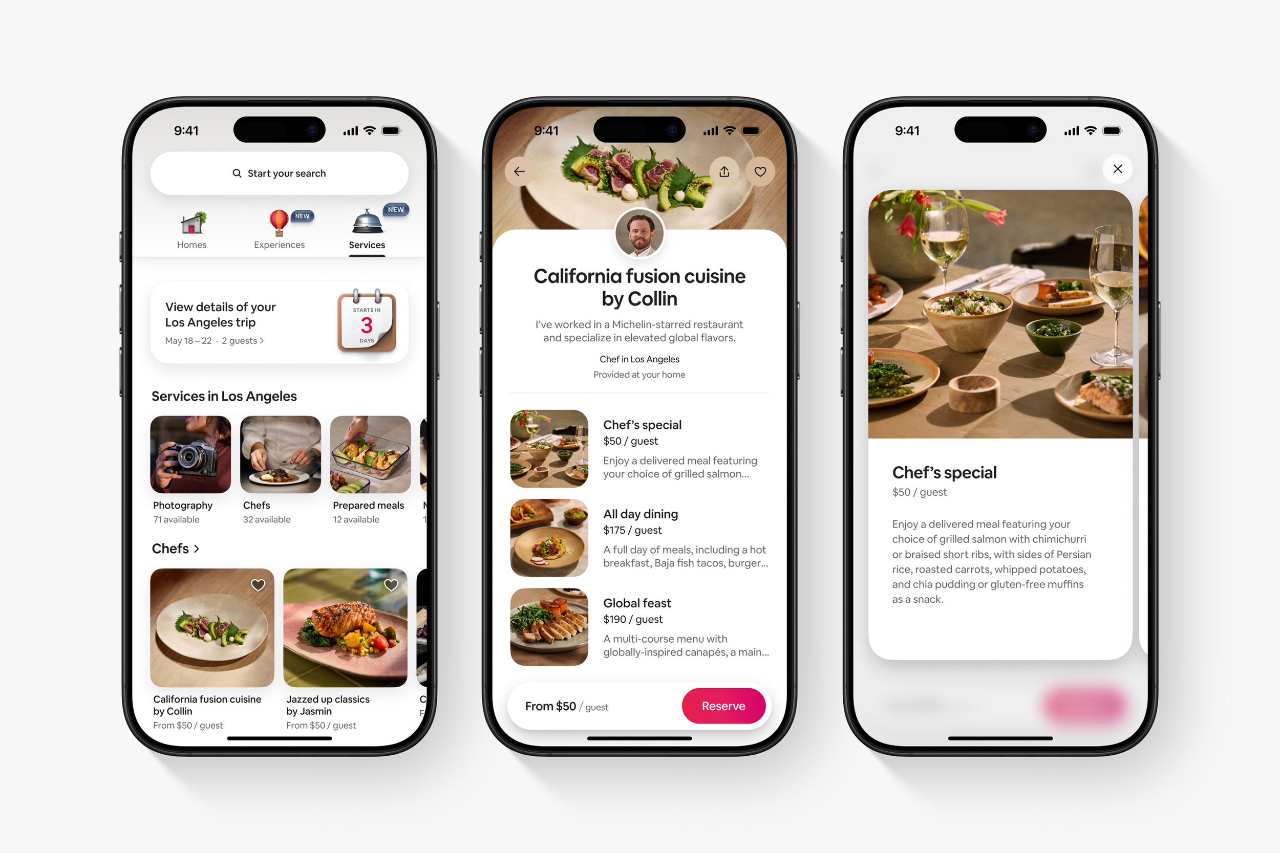
After much concepting to find the right balance of brand expression and product screen fidelity, the team decided it was most useful to first-time-downloaders to be straightforward, concise, and product accurate. While many brands use this surface as a campaign moment for flashy brand assets and sizzle reels, the straightforward approach ultimately aimed to promote user comprehension of key product features. Minimal motion was leveraged within the first screen to give downloaders a quick product overview without being distracting or overwhelming.
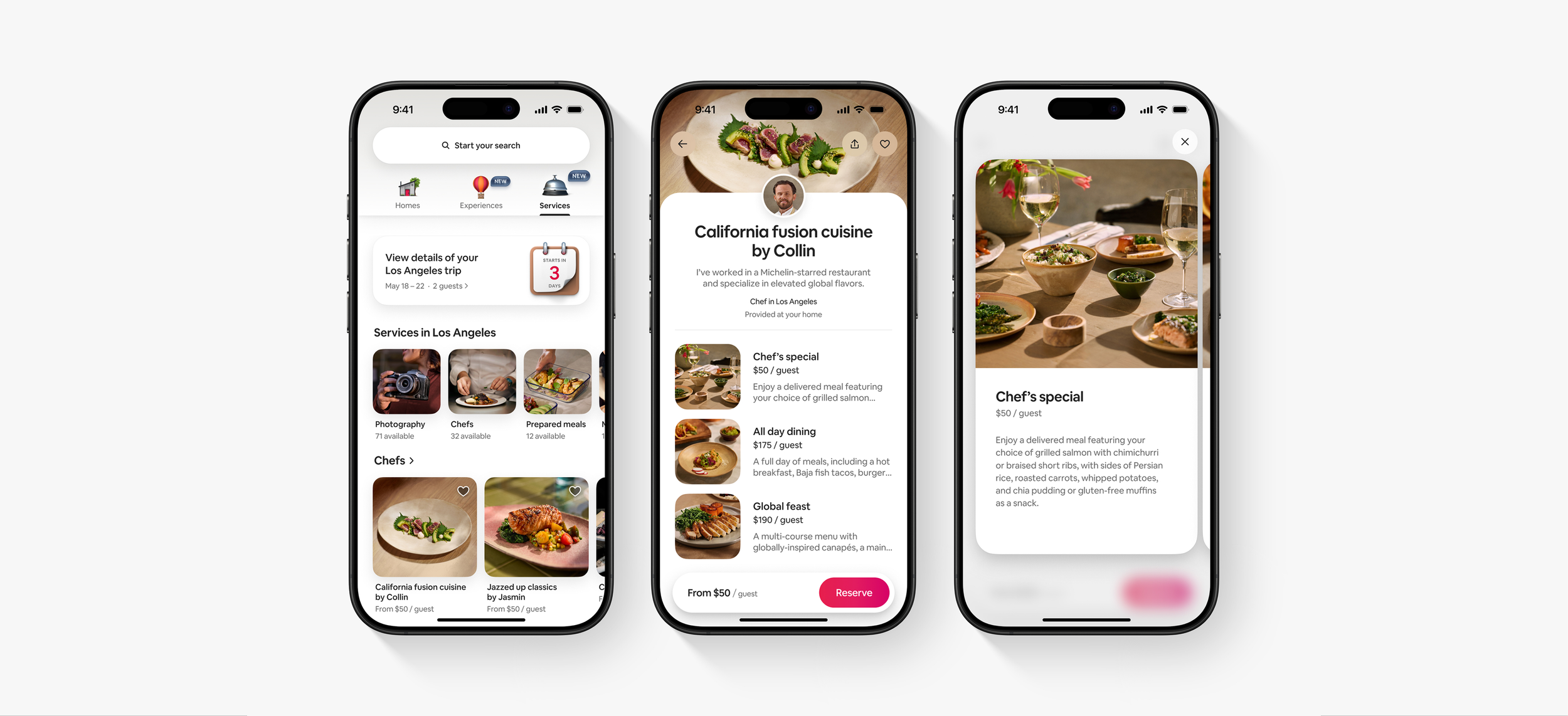
The Carousel

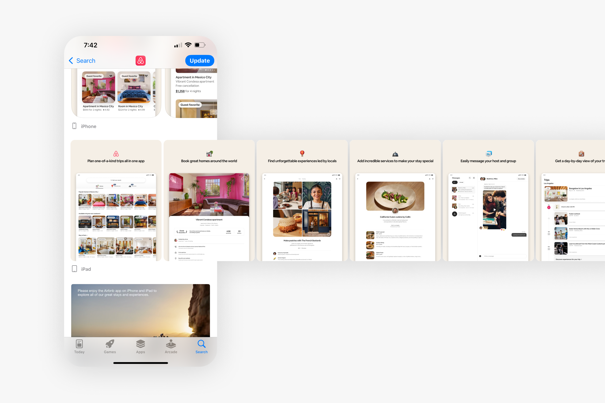
While mobile is the primary way users access and browse the App Store it was important to consider tablet proportions for the carousel as Airbnb also supports a tablet app. Styling, ratios, and language were translated into the more square proportions of tablet to directly correspond with their mobile carousel counterparts.
Carousel: Tablet
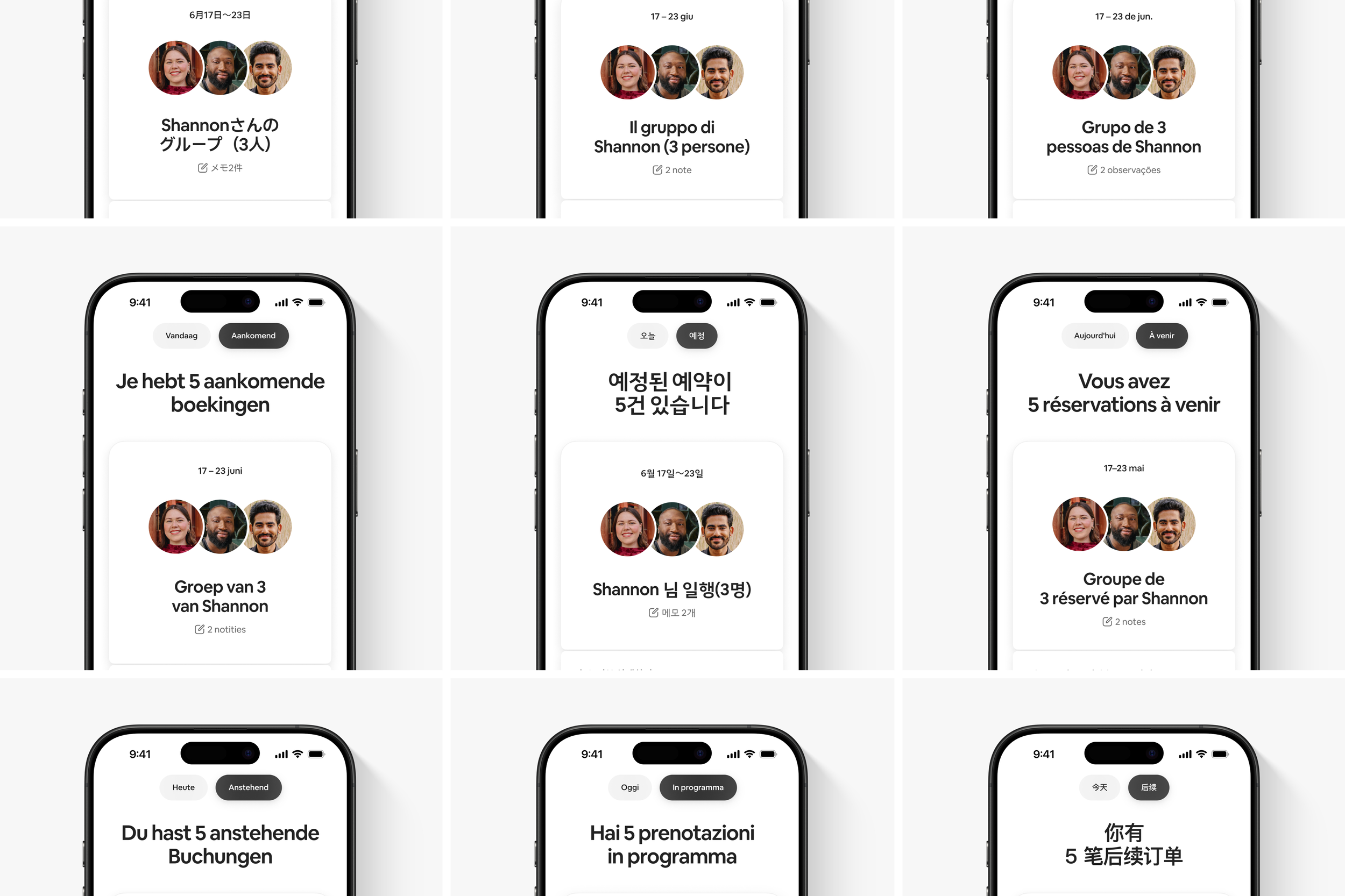
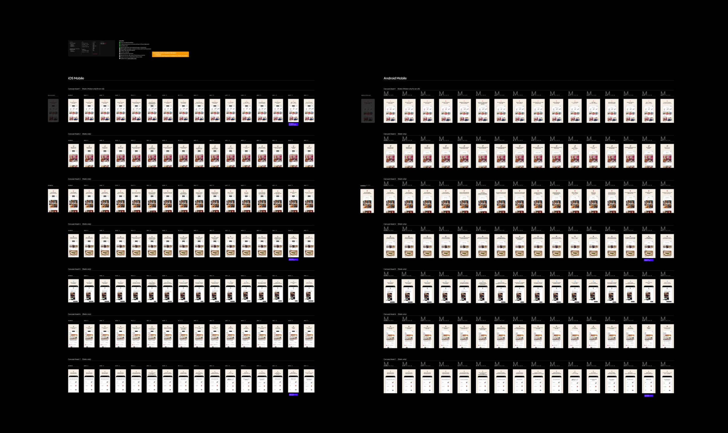
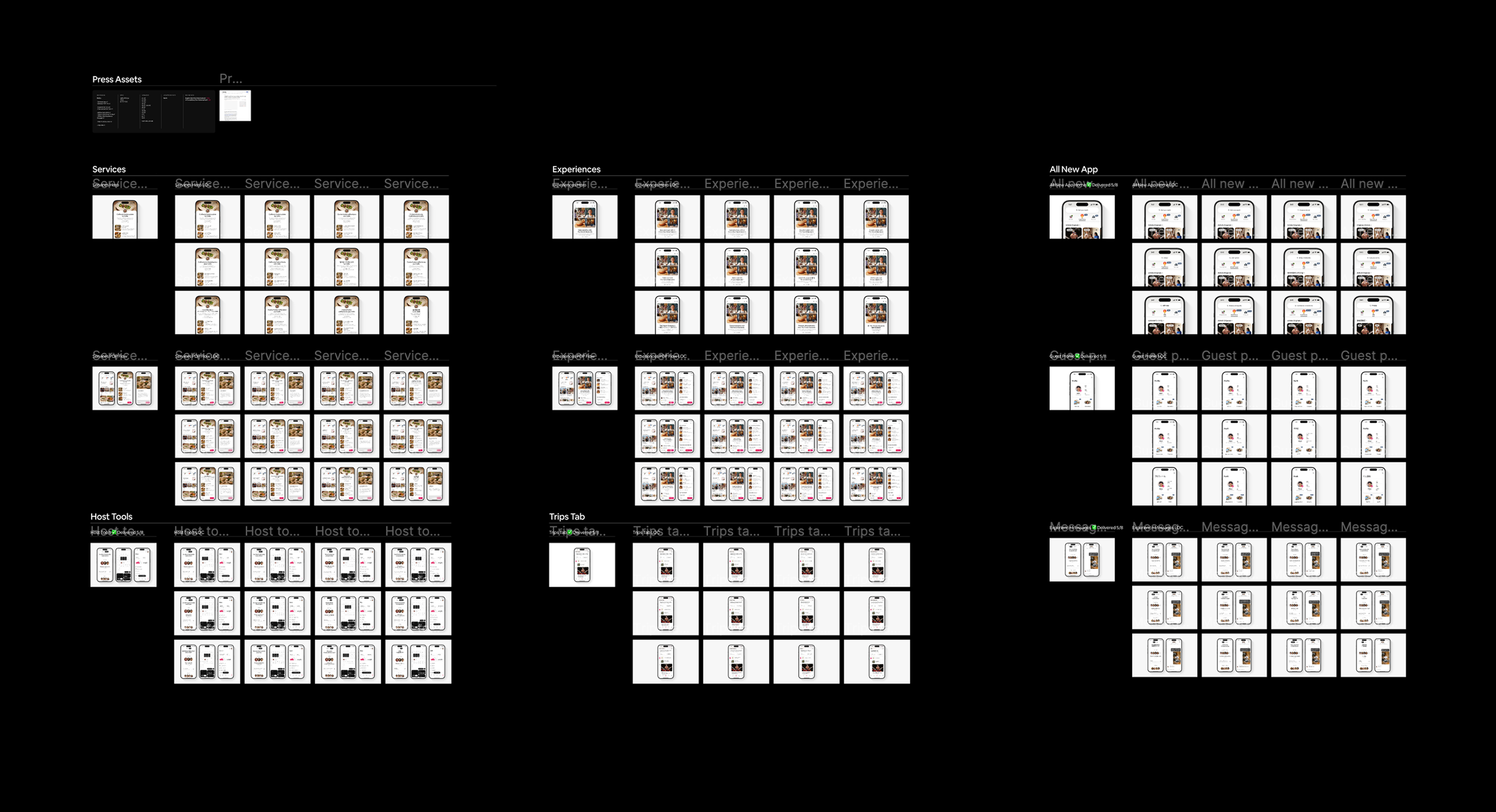
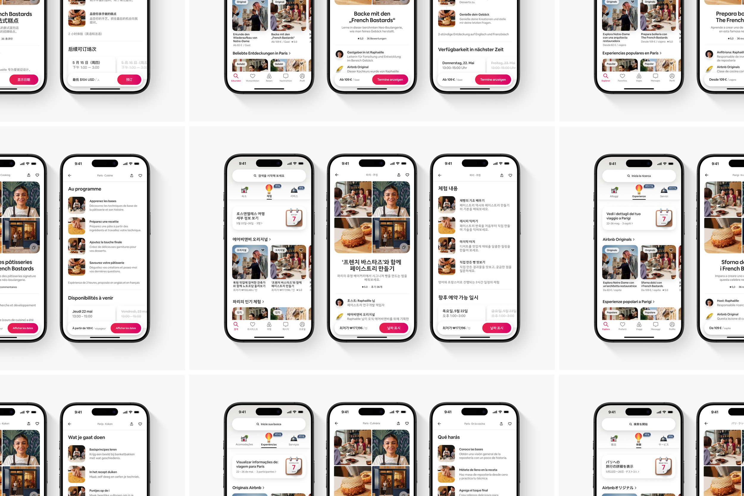
After all design decisions were set, it was time to move into the production stage. This included not only applying the most up-to date content to the designs, but setting type/product proportions and ensuring pixel perfect consistency. After an English version was finalized, Dallas worked with a localization team to translate the product page previews into 16 languages. Using her keen attention to detail, each translated screen’s design was carefully considered to ensure consistency and clarity. Based on each translation’s specific needs, creative liberties in size and spacing were taken to avoid any awkward cropping of design elements or loss of important product information.
Production & Localization
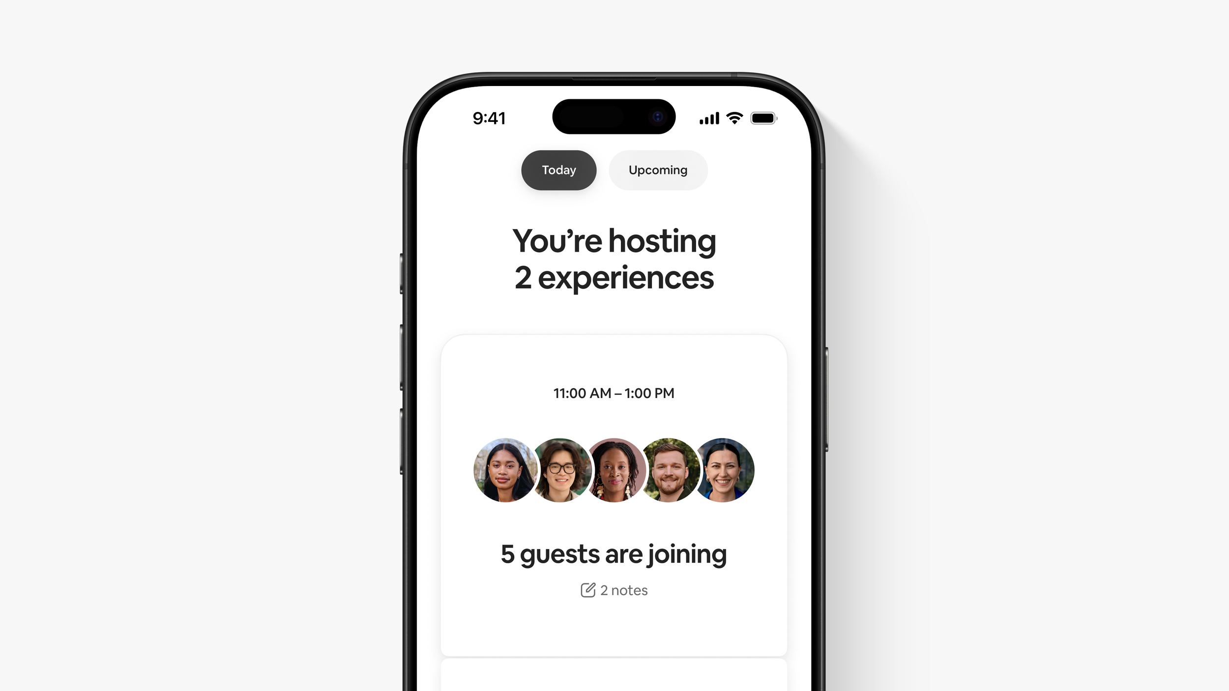
For In-App promotions, the goal was to highlight what’s new for Airbnb’s App Store visitors. These temporary placements are meant to increase visibility, boost engagement, and communicate updates and announcements. In the case of Airbnb – announcing the Summer 2015 Release. Dallas’s mission was to find a creative solution that signaled something new was happening for Airbnb and through this, increase traffic for returning guests.
In-App Promotions
The creative solution landed upon was to feature a grid of photos that communicated Airbnb is more now than just homes – that you can now book services and experiences to enhance your trip. The grid mimics the index-view in the product itself when viewing a gallery of images. This nod to product accurate UI provides some context to users for what they might expect in the new app, while providing a space to communicate this promotions key message: You can now Airbnb more than an Airbnb.
Promotions: Solution


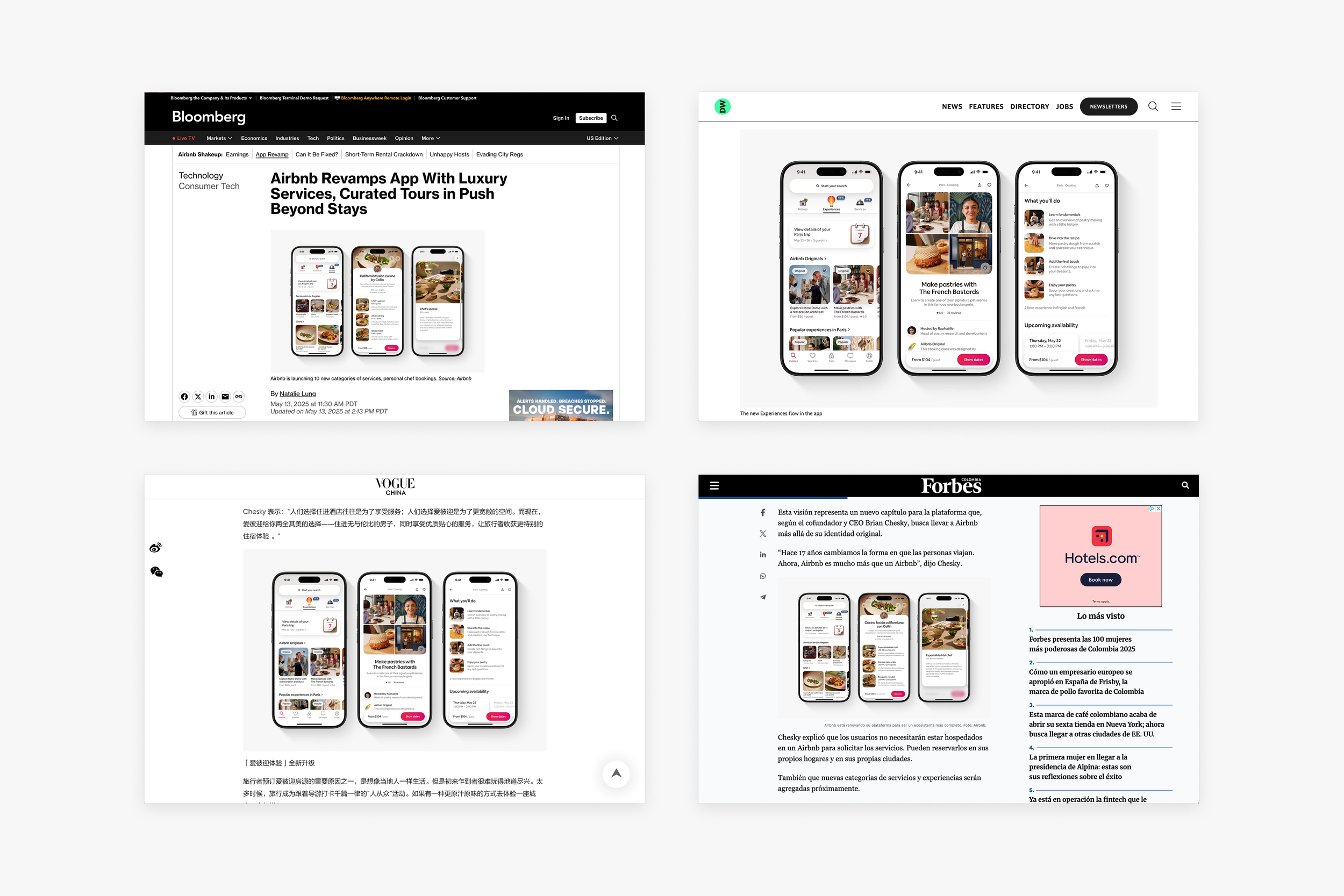
Press
To further promote the Summer 2025 Release, Dallas was tasked with creating a set of assets for press outlets that highlight certain new product features and capabilities. These assets were to be simple and flexible enough to fit into any press article seamlessly while quickly conveying the product feature being highlighted. To achieve this, Dallas took creative liberties on product-accurate screens to create a marketing-friendly look into the all-new-app.
Press Assets

Since it was expected that the buzz around this release was to be global in scale, these press assets were requested to be translated into 12 different languages. Similar to App Store assets, each translated screen’s design was carefully considered to ensure pixel-perfect consistency. Based on each translation’s specific needs, further creative liberties in size and spacing within each product screen were taken to avoid any awkward cropping of design elements or loss of important product information.
Production & Localization
Resource Center
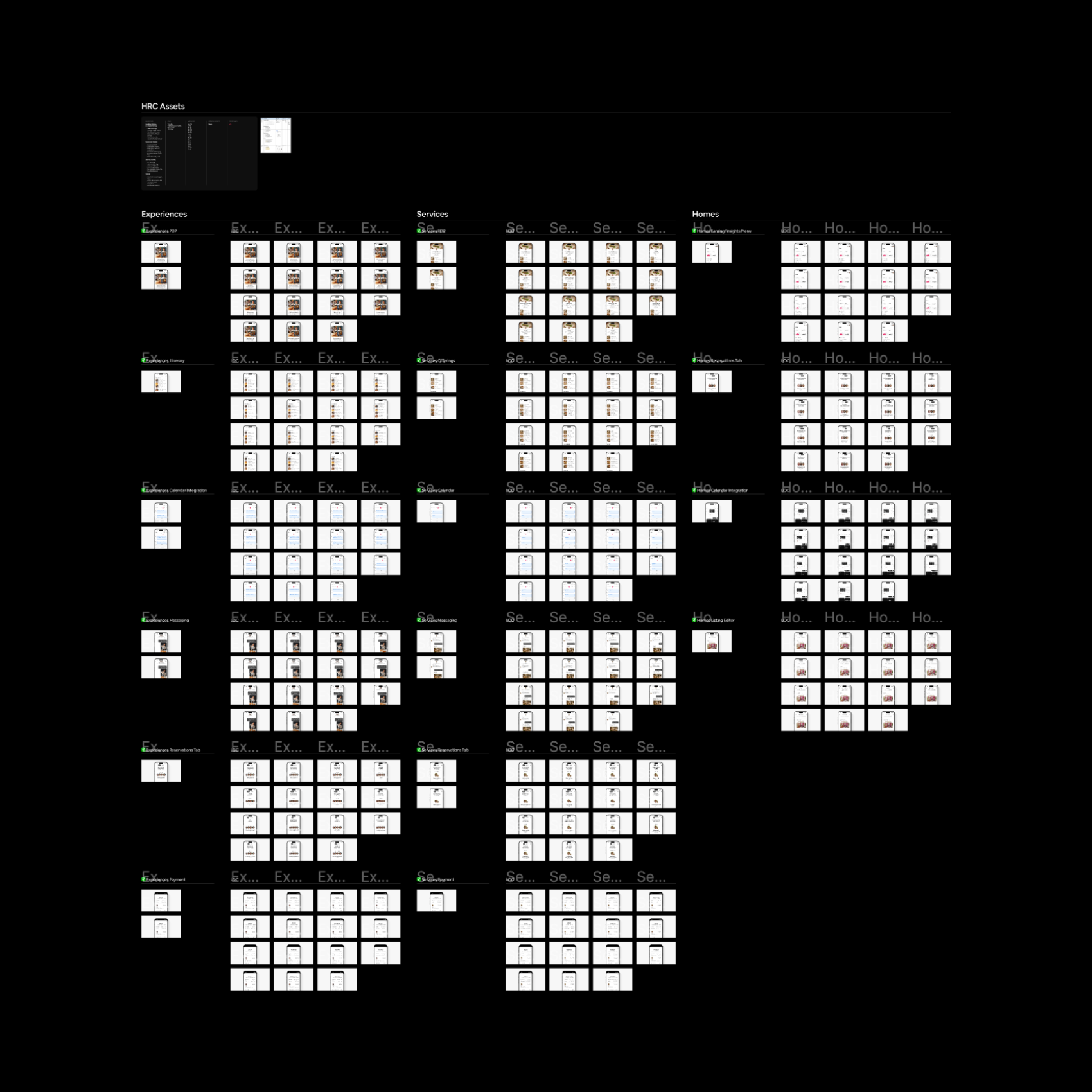
The Resource Center is a platform for hosts to find the newest Airbnb information, updates, and answers to their hosting-related questions. With such a major update to the Airbnb App, Dallas was tasked with creating a series of marketing-friendly product assets that highlighted the newest app features and updates. These assets paired with educational text are used across the resource center to enable Homes, Experiences, and Services hosts to host more efficiently.
Host Resource Center
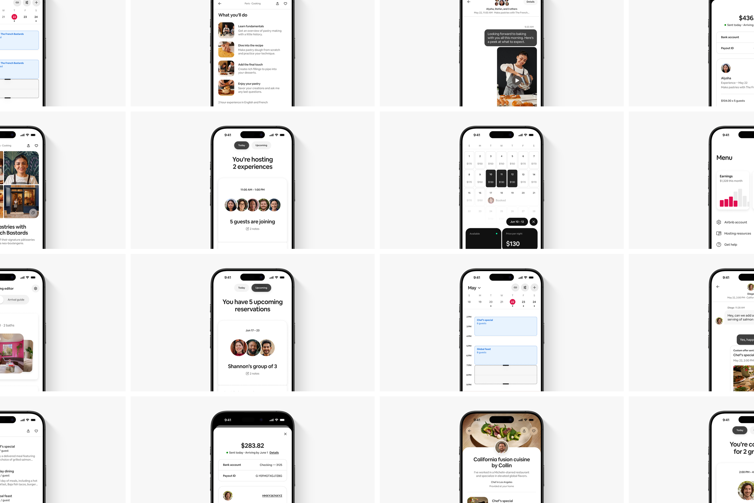
Since Airbnb hosts are located all over the world, these Resource Center assets were requested to be translated into 16 different languages. Similar to App Store and Press assets, each translated screen’s design was carefully considered to ensure consistency and alignment across all translations. Based on each translation’s specific needs, further creative liberties in size and spacing within each screen were taken to avoid any awkward cropping of design elements or loss of important product information.
Production & Localization